WeTravel
UX design for a trip planning application.
Context
WeTravel is an online tool that helps trip organizers manage their group travel. Users typically fall under the category of a trip organizer or a trip traveler.
Problem & Solution
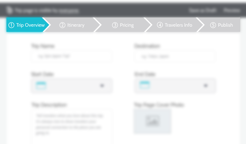
The on-boarding and core product experience were confusing to users.
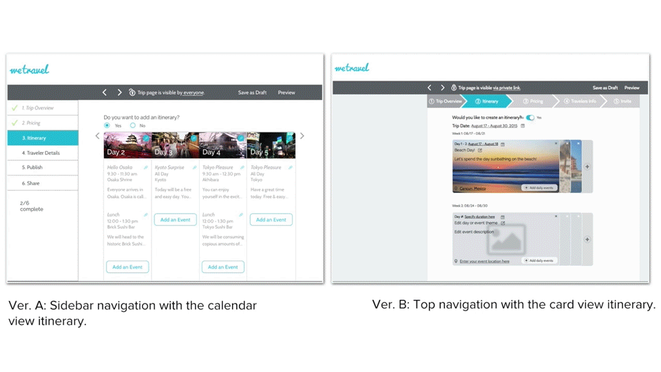
Through our process, we created an effortless flow for users.
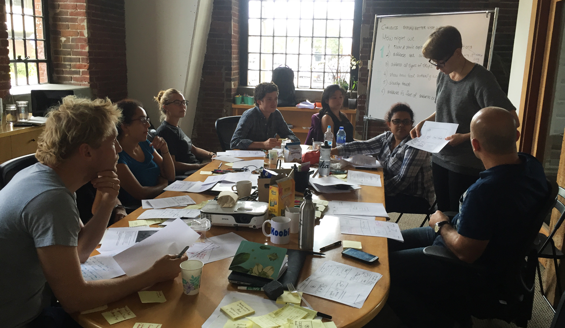
My Role
I was the Product Team Lead as well as one of the 6 Product Designers. I lead and coordinated the rest of my team in user research, usability testing and the re-design process of the WeTravel core product to improve the overall usability of the platform.
Tools
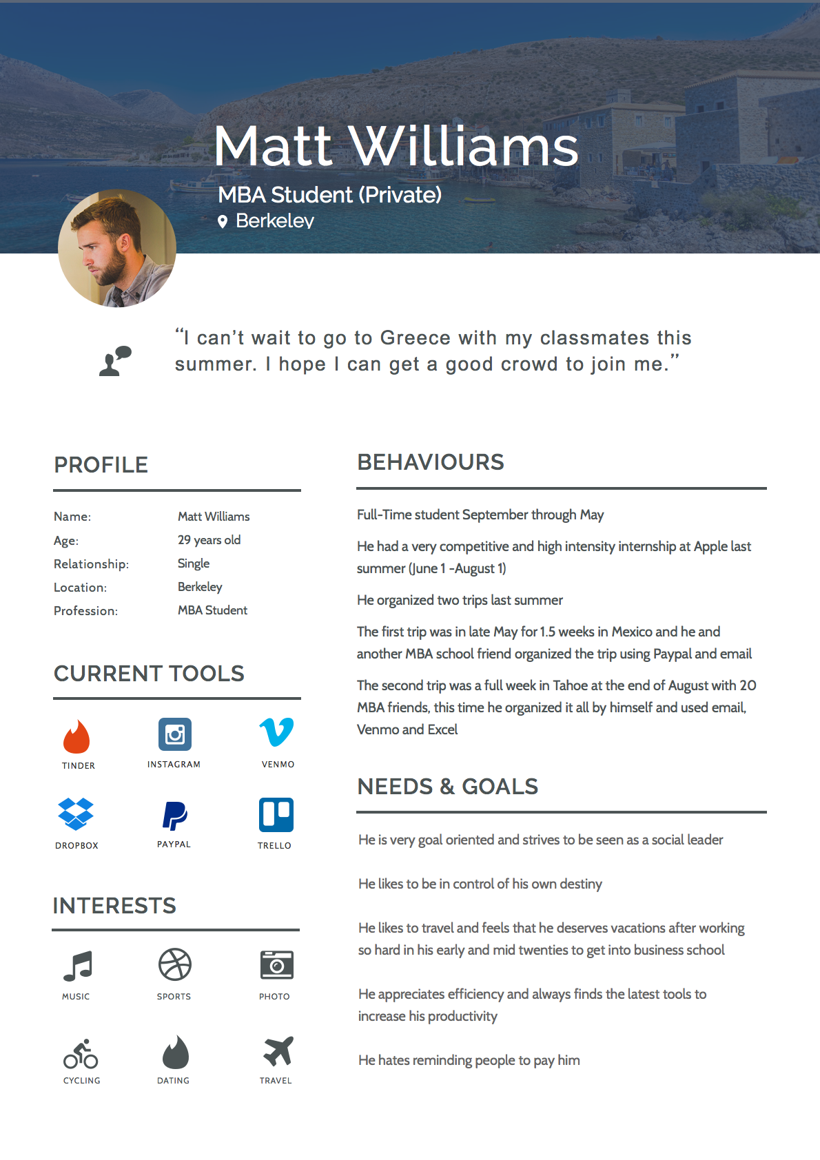
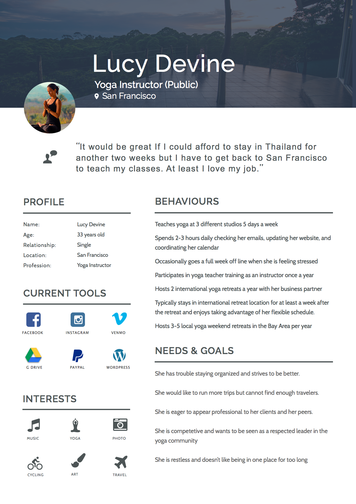
Personas • Hand-drawn wireframes • Low-resolution wireframes • Invision prototypes • Google Design Sprints • Usability Testing • High-resolution wireframes
Results
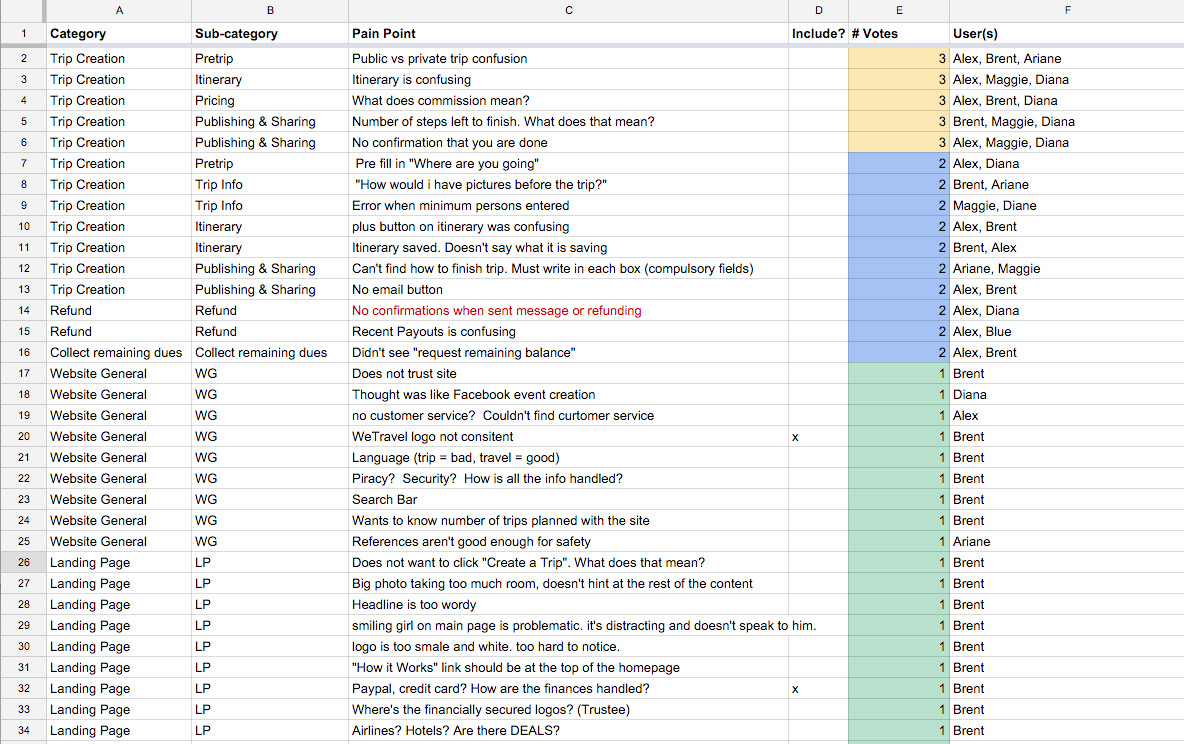
All our hypotheses were successfully validated!
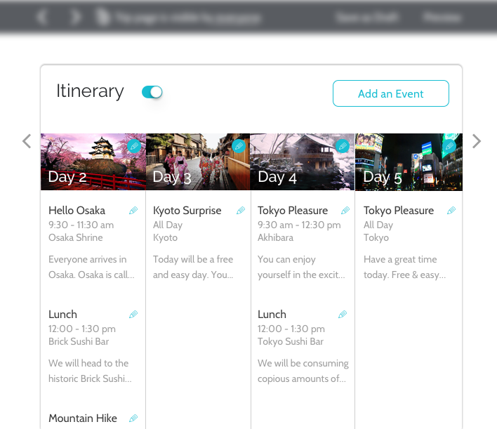
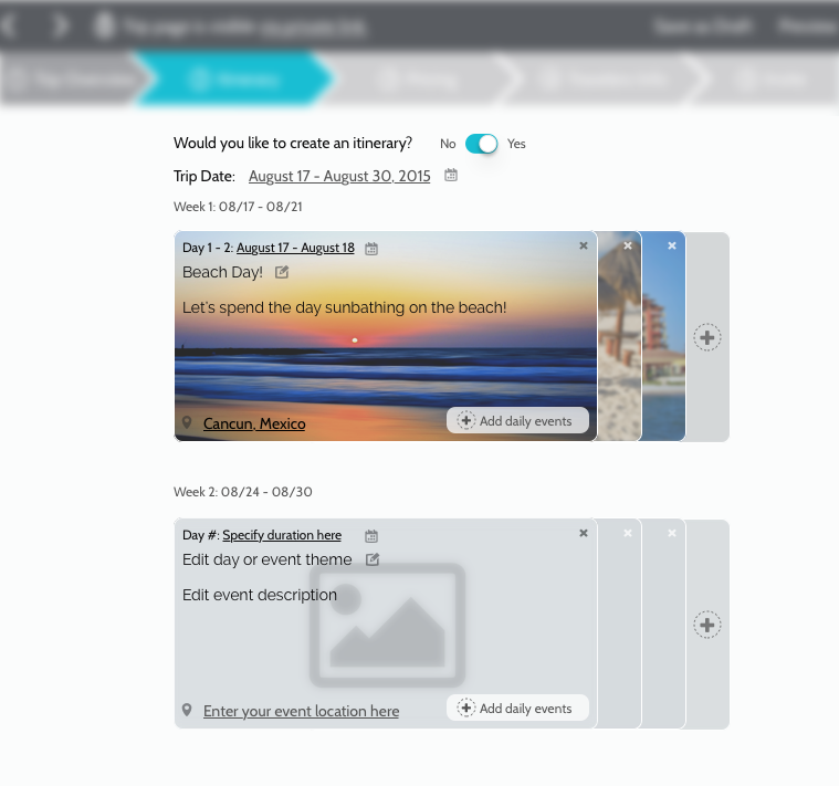
- 5/5 users successfully navigated through the Itinerary section with no difficulty.
- 5/5 users were able to clearly explain the difference between a Public and Private trip.
- 5/5 users understood what the WeTravel Service Fee meant.
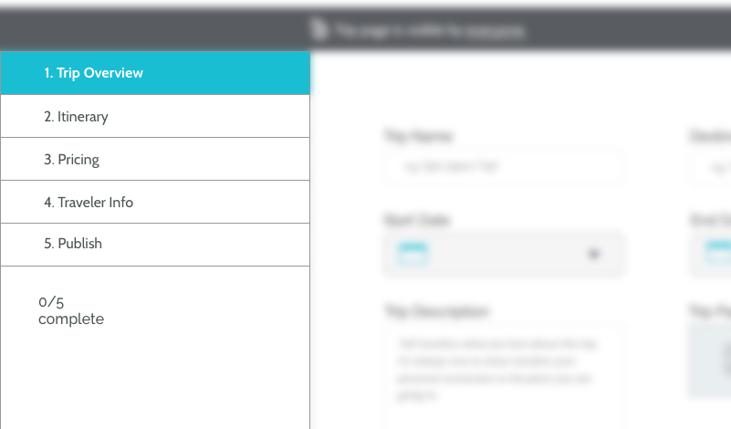
- 5/5 users were able to successfully navigate through the whole flow with clear comprehension of where they were, and how many steps were left to complete.
- 5/5 users knew when the Trip Creation process had been completed.